TEXT BY MICHAELA MULLIN | VIEW IMAGES
In Bloom
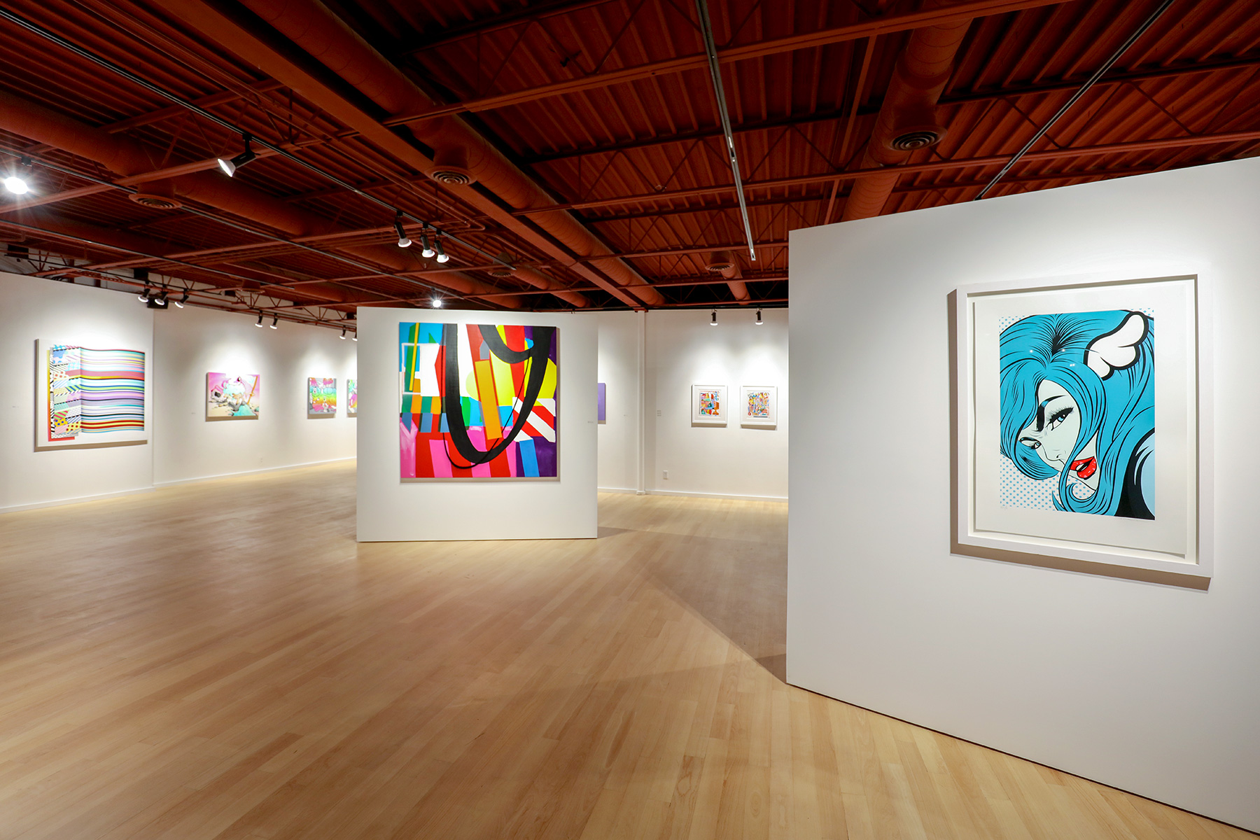
Jason Woodside curates like he paints—choosing elements that contrast to create a positive visual experience. This exhibit operates on many levels, but the primary one is as a palette of vibes that Woodside mixes: combining the hues, lines, and energy of peers and friends. Those internationally-acclaimed street and mural artists whose works are also featured in In Bloom are: SWOON, D*Face, Ruben Sanchez, Adele Renault, Pref, ItsALiving, Adam Lucas, Maser, and Buff Monster.
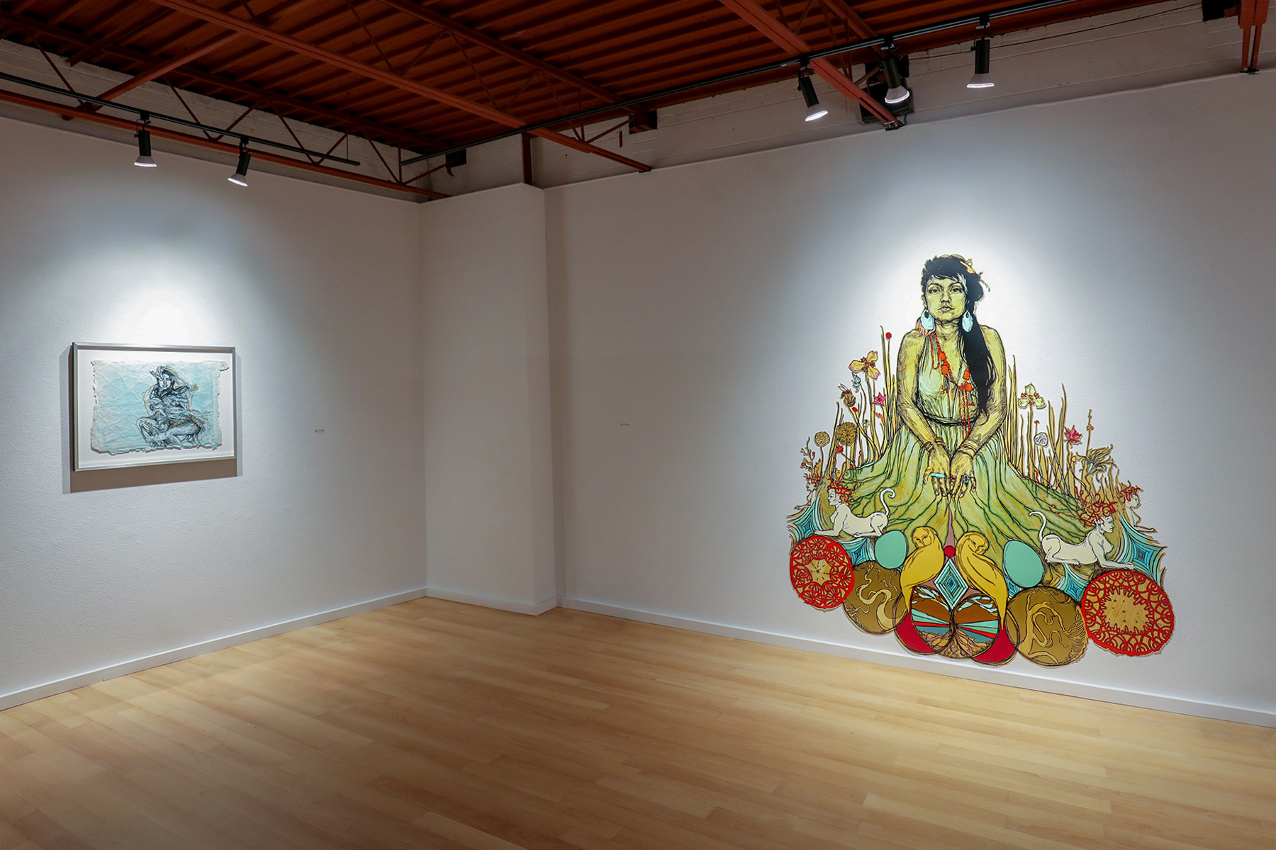
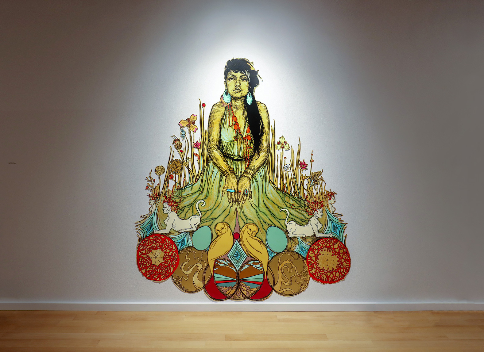
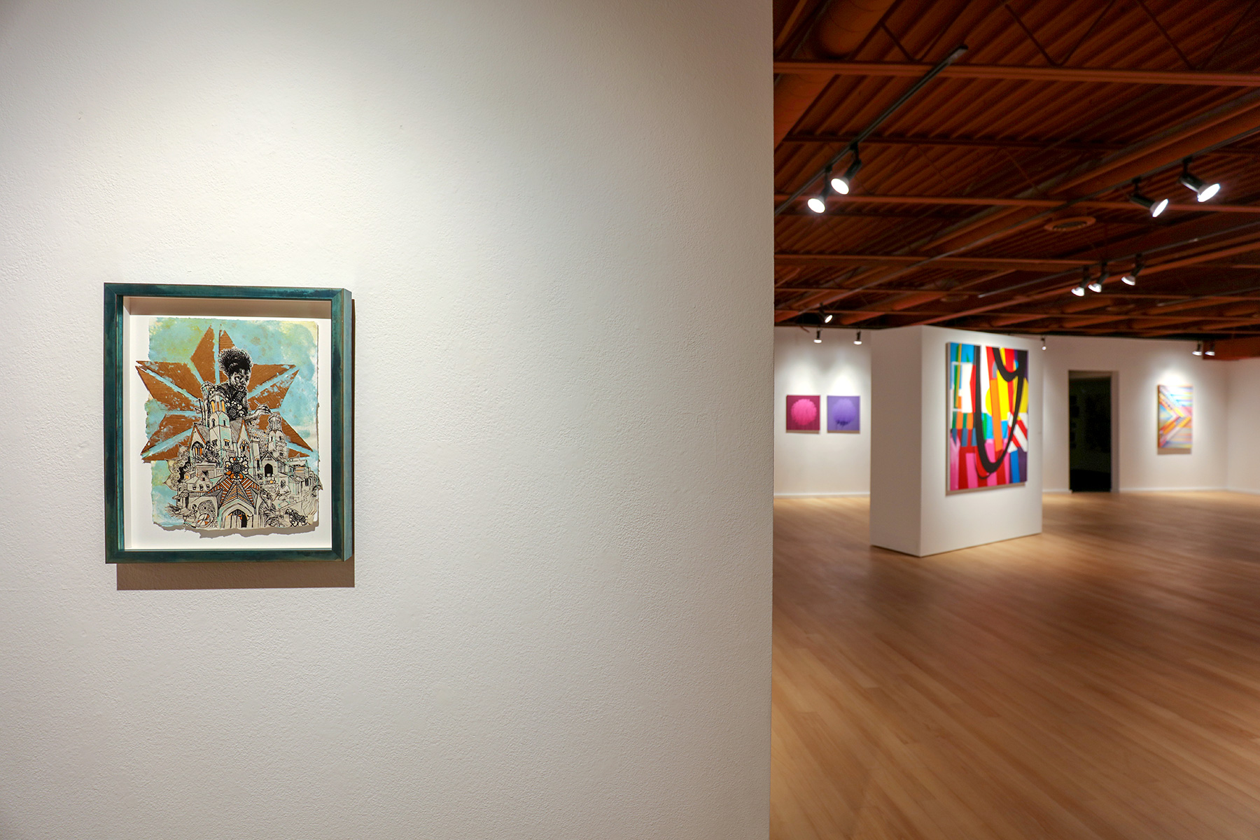
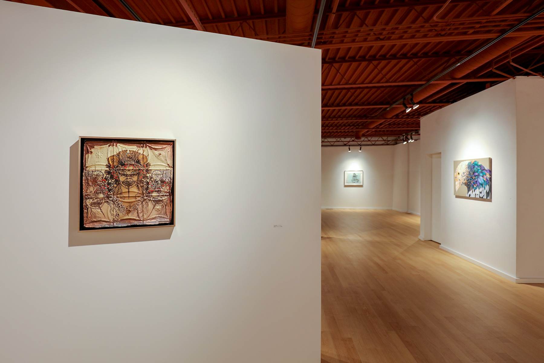
SWOON works with raw and sometimes fragile substrates–handmade papers, fabric, and mylar, to name a few. The vulnerability of these materials informs the subject matter, as well, and beautifully contradicts the strength and images she presents. Her figurative works, “Monica,” and “Moni and the Sphynx | EV 2/9,” present women at rest, but in their equilibrium, they emanate amazing strength. Monica is wrapped in nature—feathers, leaves—or is she becoming? Moni is surrounded, enveloped by iris and pod and bird—the stillness at the core of it all. The mylar cut outs that hold her are thin and delicate, each stem gently nailed to the wall. “Neenee,” on the other hand, is of a woman who calmly watches over and simultaneously creates sacred architectural structures, and the community around them, empowered by the mere scale and proportion of her body to the building. “The Devouring” is reminiscent of Polynesian art—a powerful work on tin tiles, in dark beige, red, and black. The masks that are crowned by mouths and hands and teeth and skeletons are softened by the presence of the snake tongue that these three divine figures let hang at the viewer.
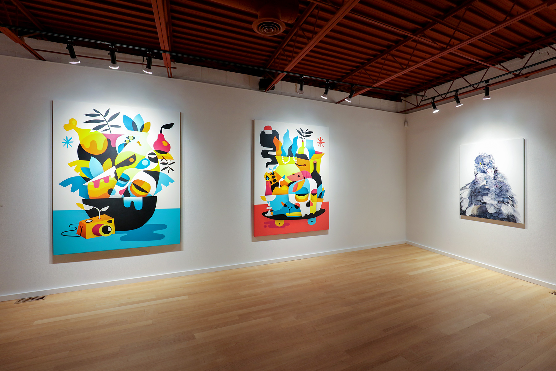
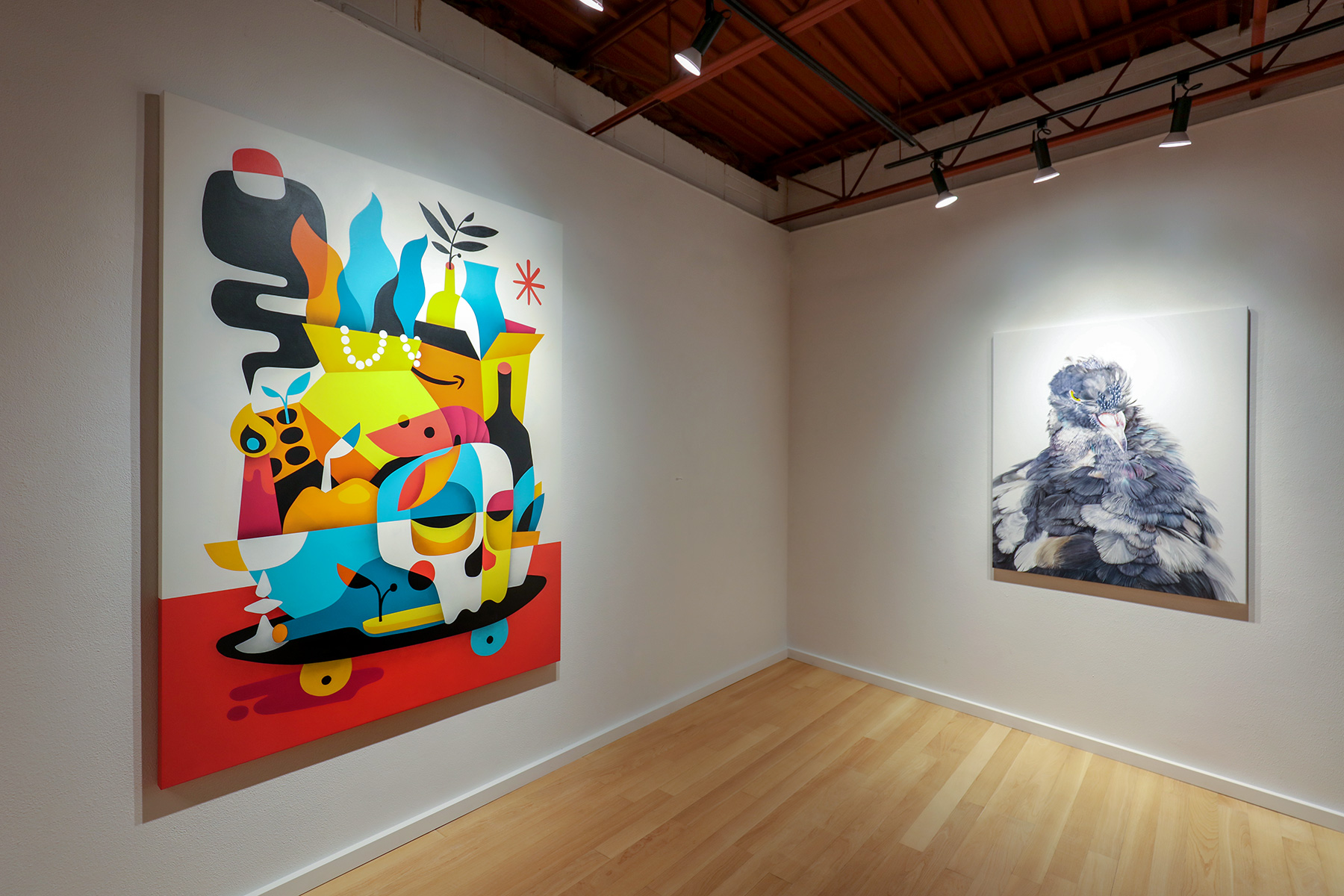
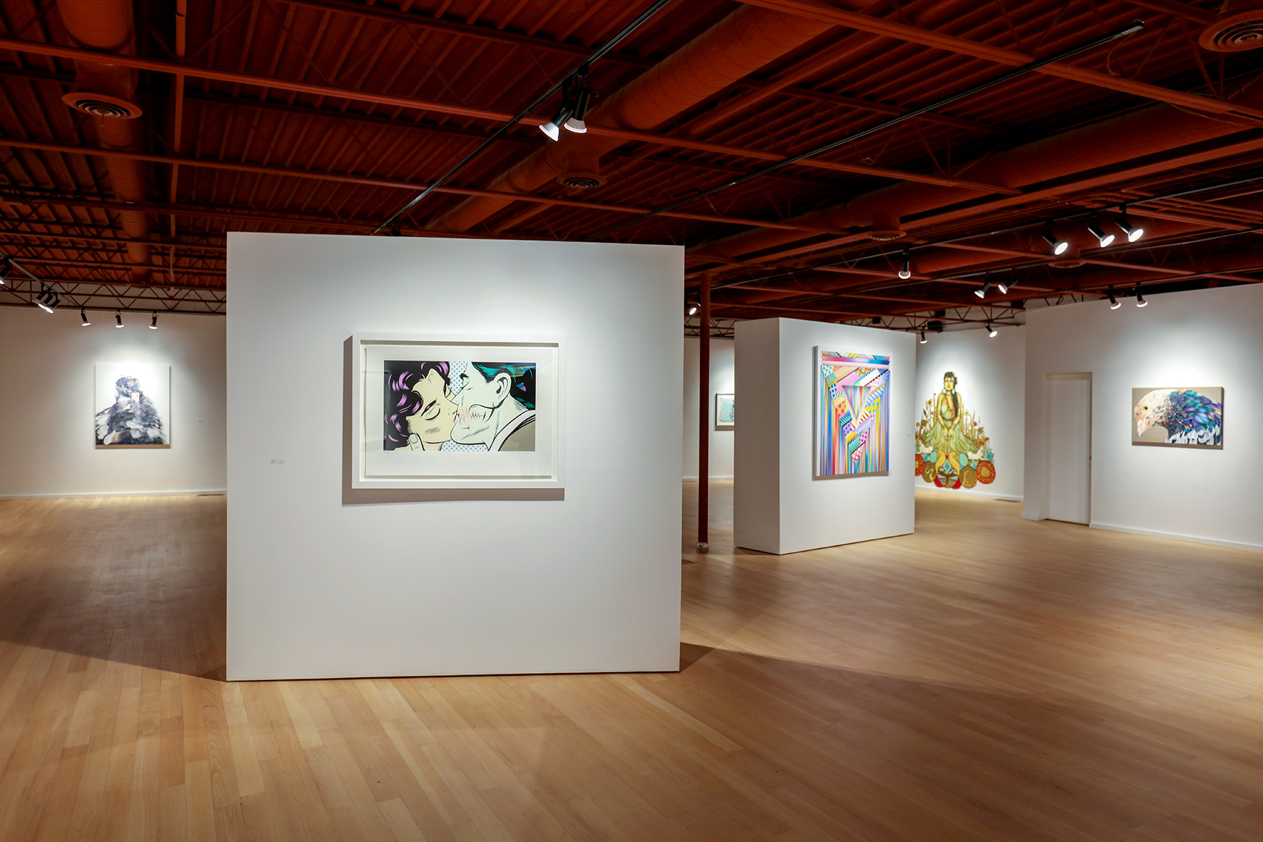
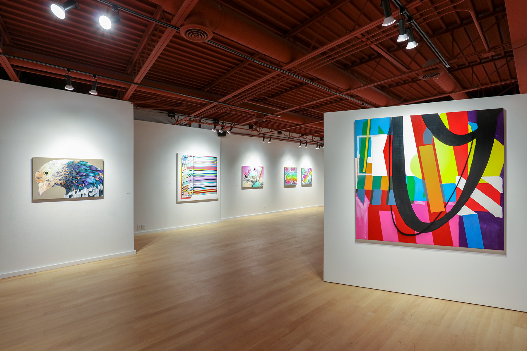
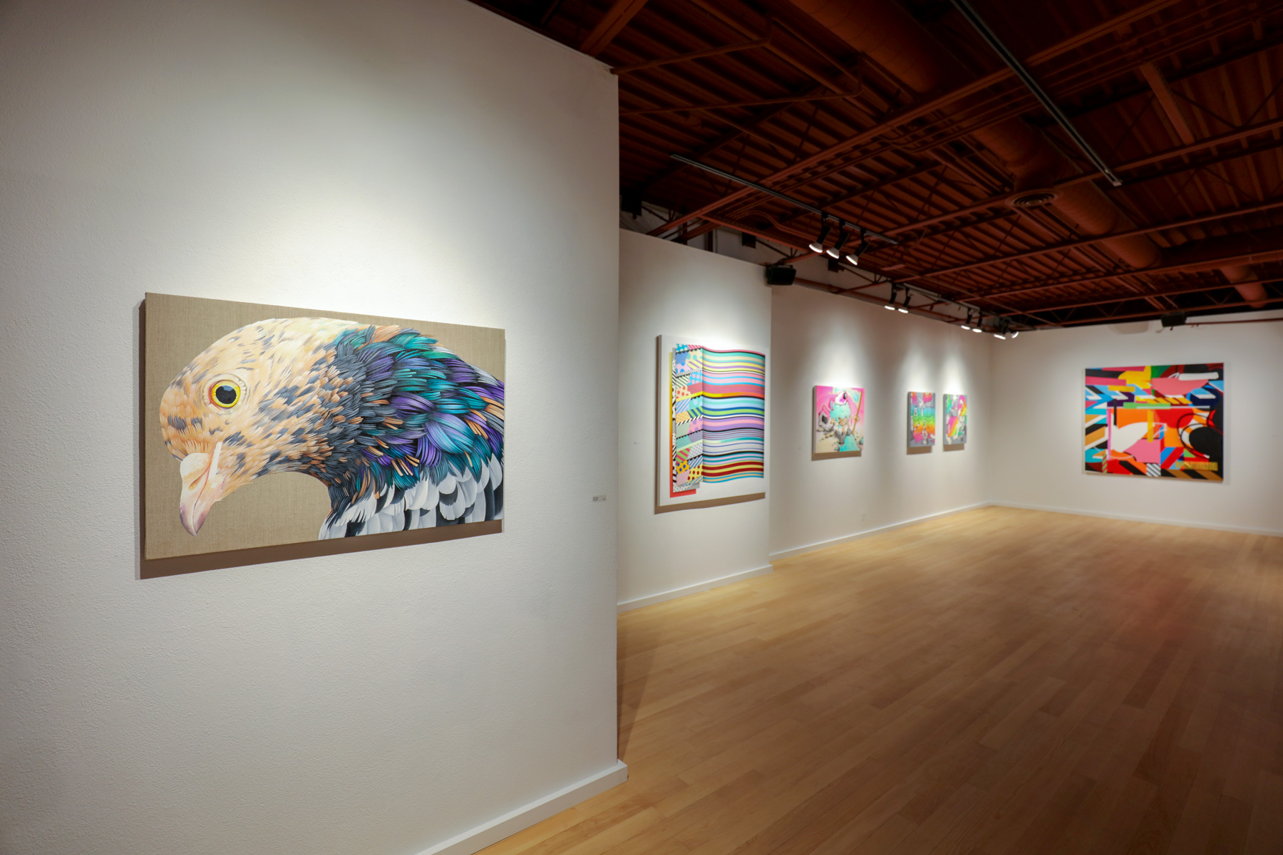
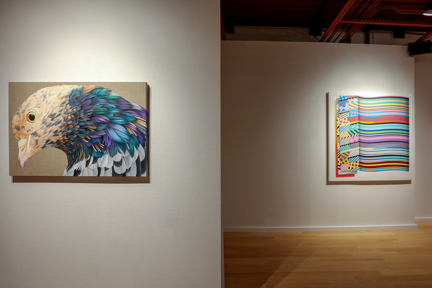
A master of the avian figure, Adele Renault’s two large works bring us into the space of a creature that might normally fly away. “Almond Pigeon” is a stunning close-up on raw beige linen that gives the bird a more natural background; its feathers are bundles of short strokes, of peaches, purples, greys, and blues. Its beak tips off with a dark purple keratin, and Renault is so intent on offering the viewer a microscope, there is even a reflection in the golden eye. Renault’s “Camp’s First Moult” is less contained, less tight, as its title implies. Camp is grey, a little red, black and white all over—but due to its transitional state, the bird body is less defined. This oil on linen focuses on the growth aspect of moulting, the lightness that exists as things shed. The subdued palette lends to the softness that this bird evokes, and even the beak starts to blend into the bird’s chest color. The thing that remains firm is the golden eye, this time with a small speck of light to match the white which highlights the canvas.
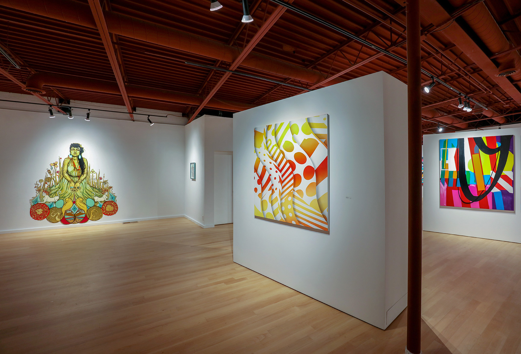
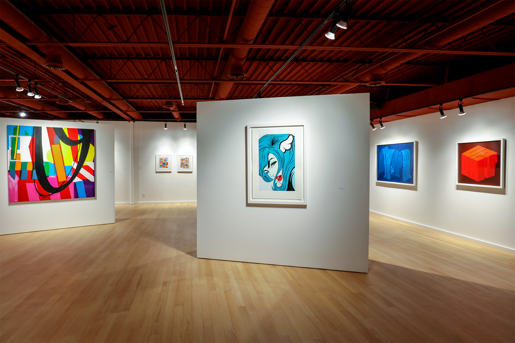
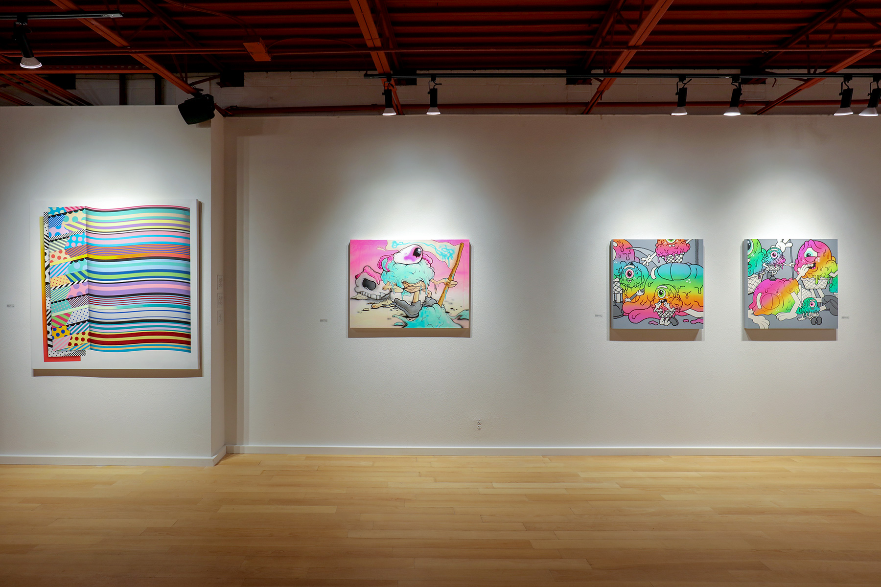
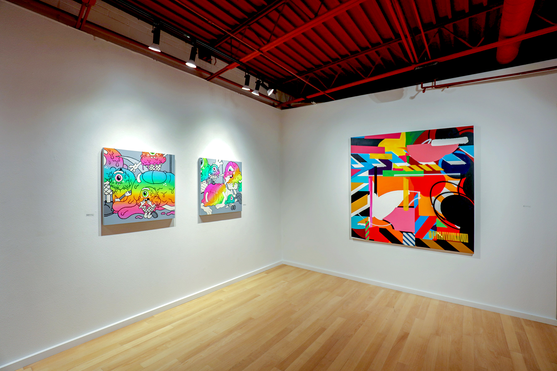
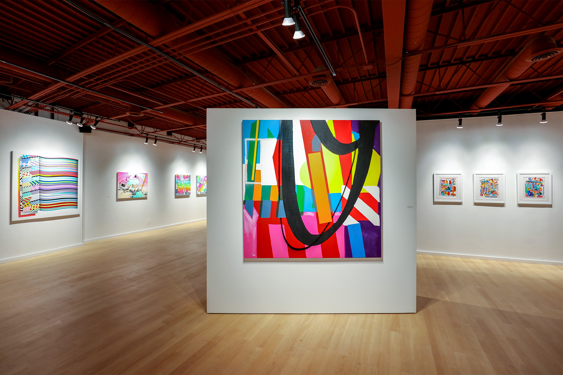
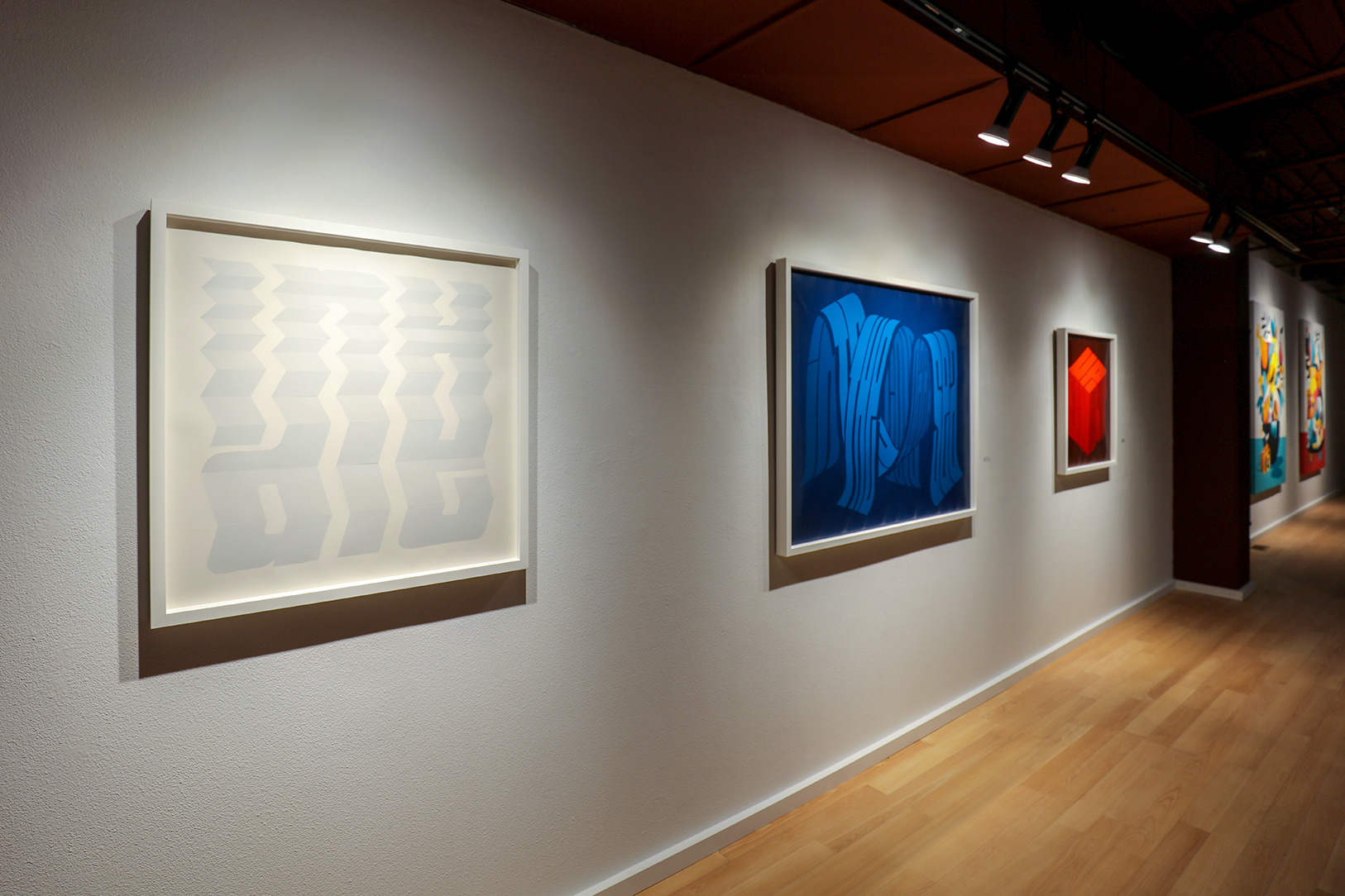
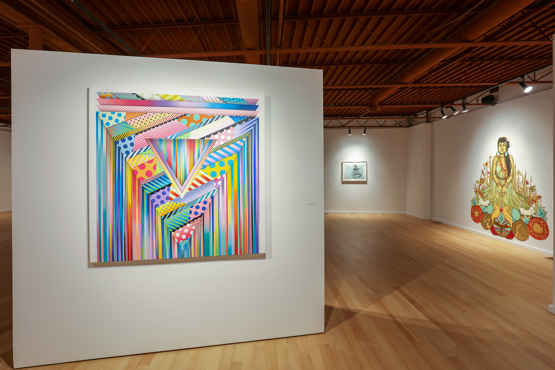
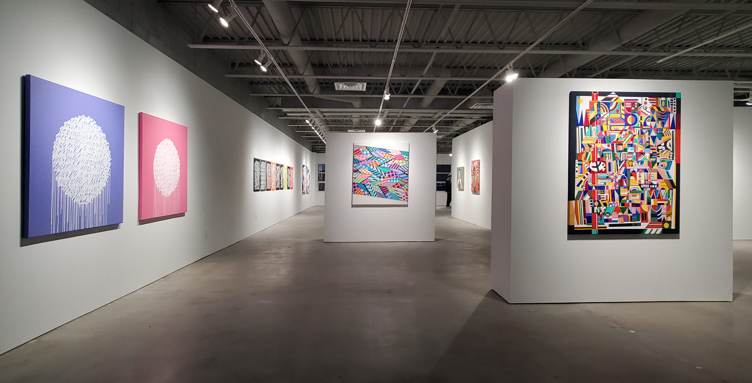
Maser’s two abstract acrylic paintings also use white to accentuate; now it is not light and shadow, but presence and absence of shape. Maser also uses solid segments of black to overline the colors, and stark and bold forms. Discrete boundaries and edges are often honored, but not always, acknowledging bleed, and while not blending, or fading colors, there is a nod to the mixing, matching, layering, and contrasting that allows for the wildest visual conversation to take place on his canvases.
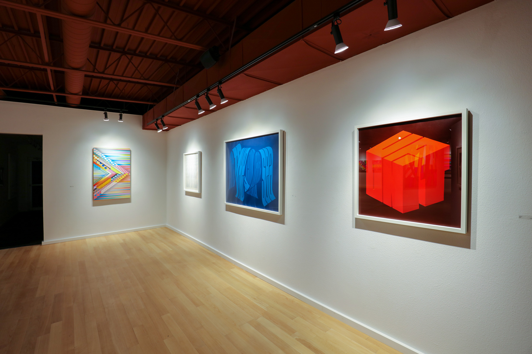
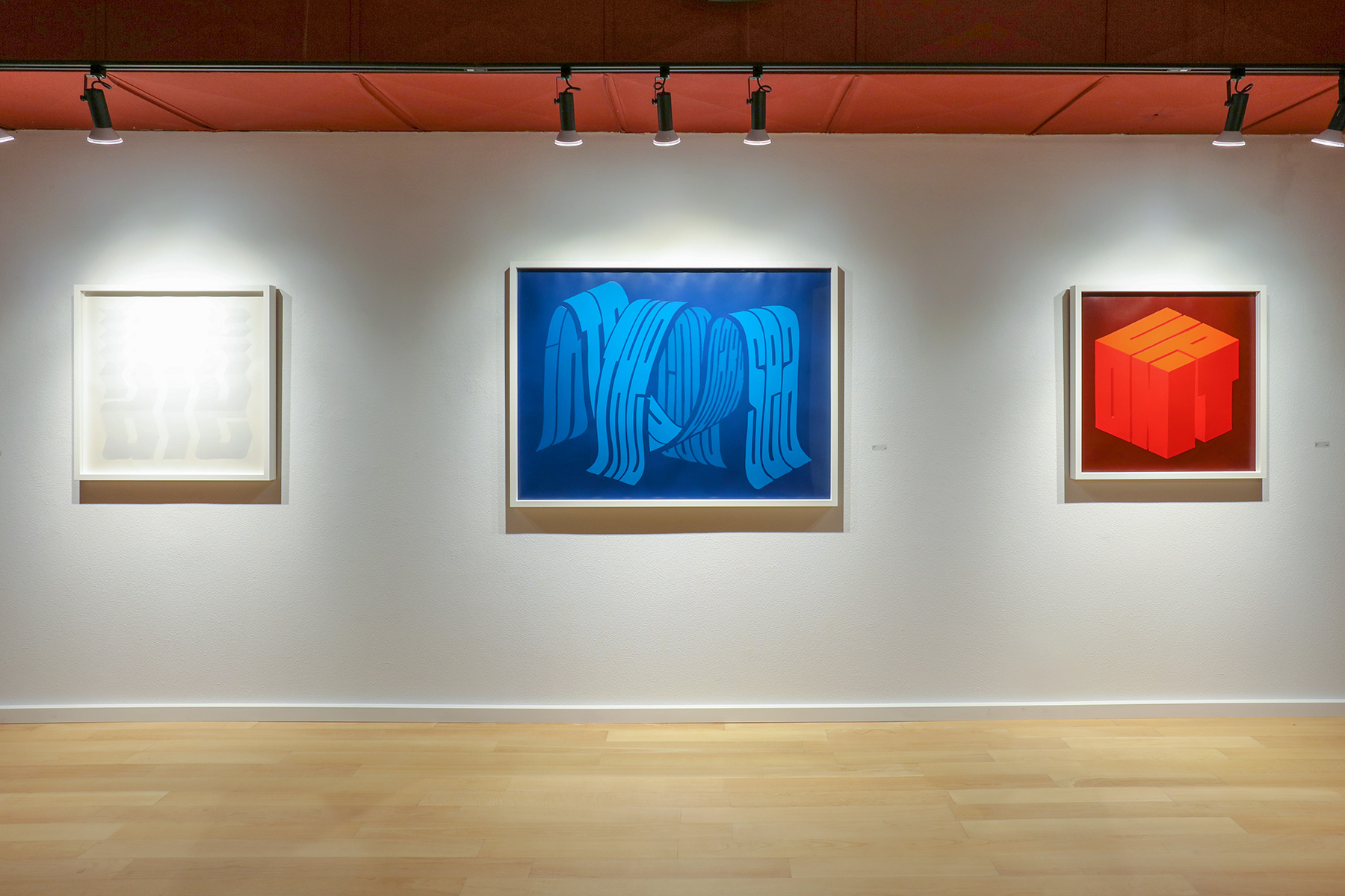
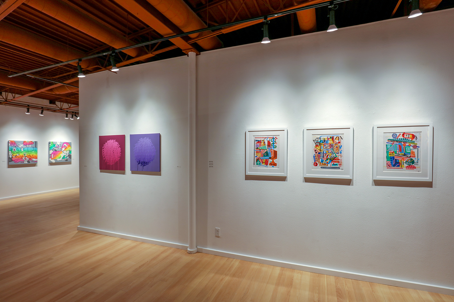
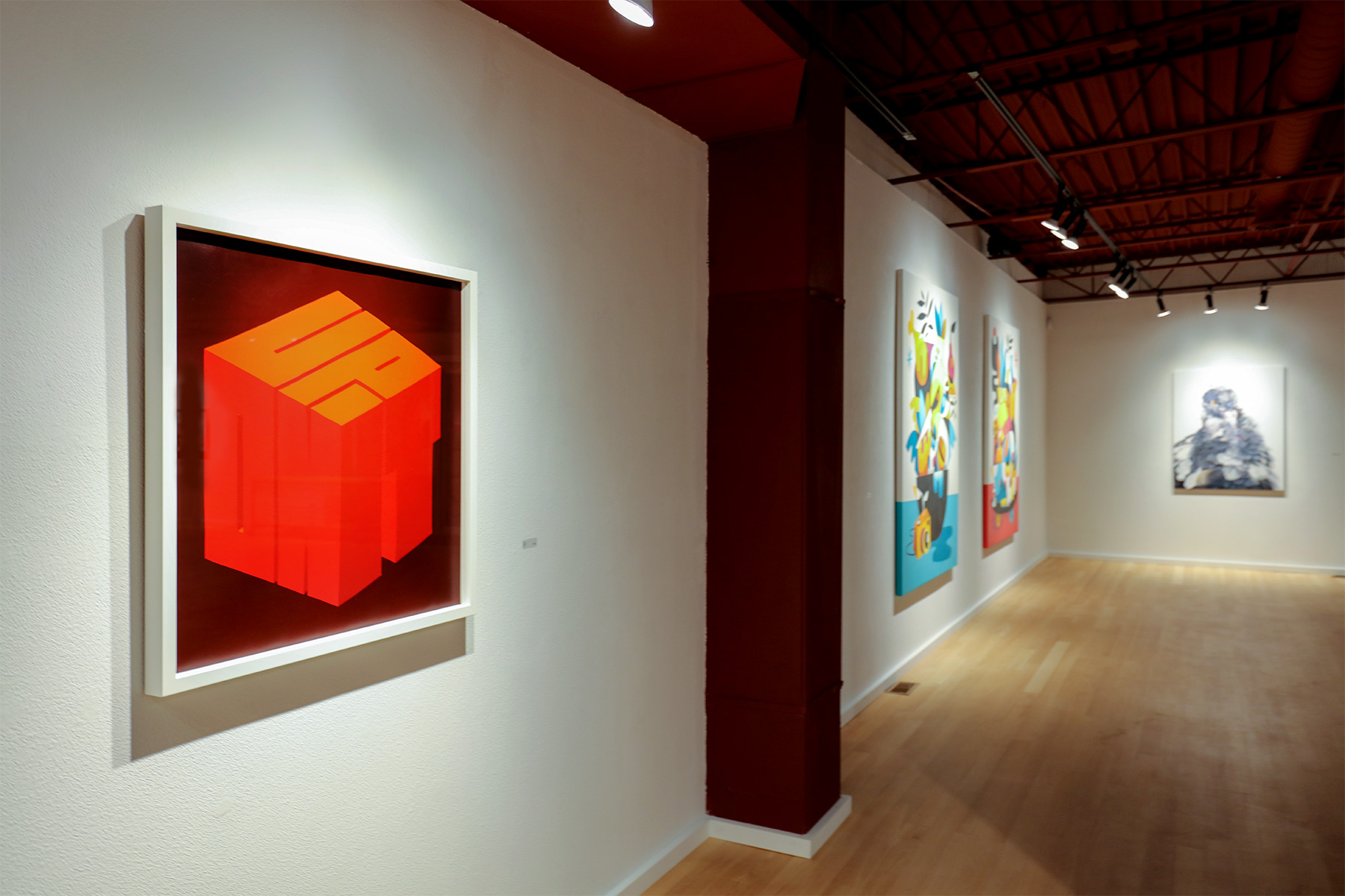
Pref’s textual works, like concrete poems, work to do what they say. On view here are all three states of matter: solid, liquid, and gas—respectively, “Up On It,” “Into the Sea” and “Inhale.” Deceptively simple but puzzling enough typographically to make you search, tilt your head, think about directional reading of text and then unlearn it. The solid is in red letters, a block, on black. The liquid is in blue, making waves, on black. The gas is white accordioned on white, however. Again, a sensical correlation—words, shape and color. But these paintings are gorgeous in their minimal simplicity and their three-dimensional reach—surprising in how effective they are at conveying exactly what they say—human communication rarely works as beautifully and directly as these paintings do.
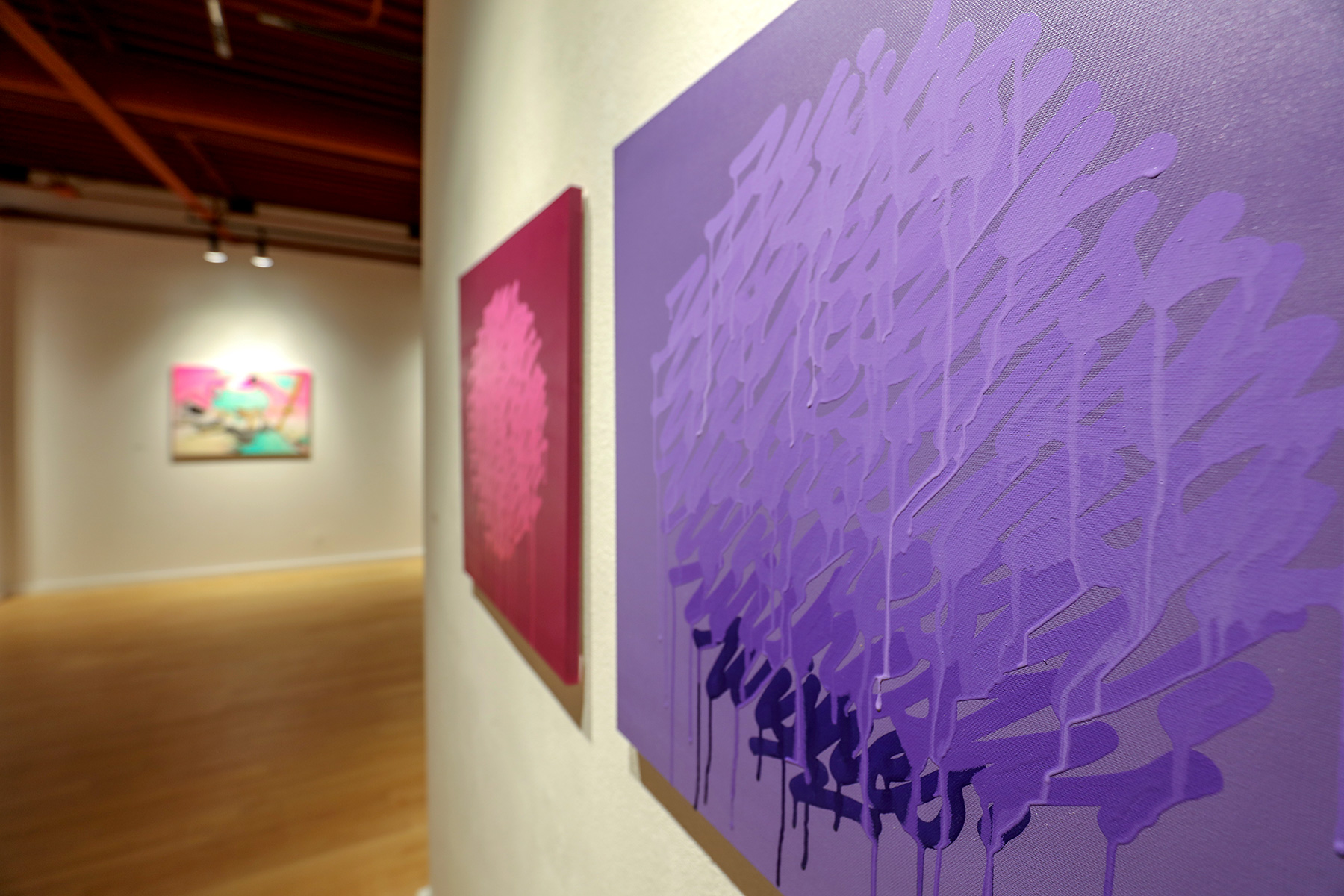
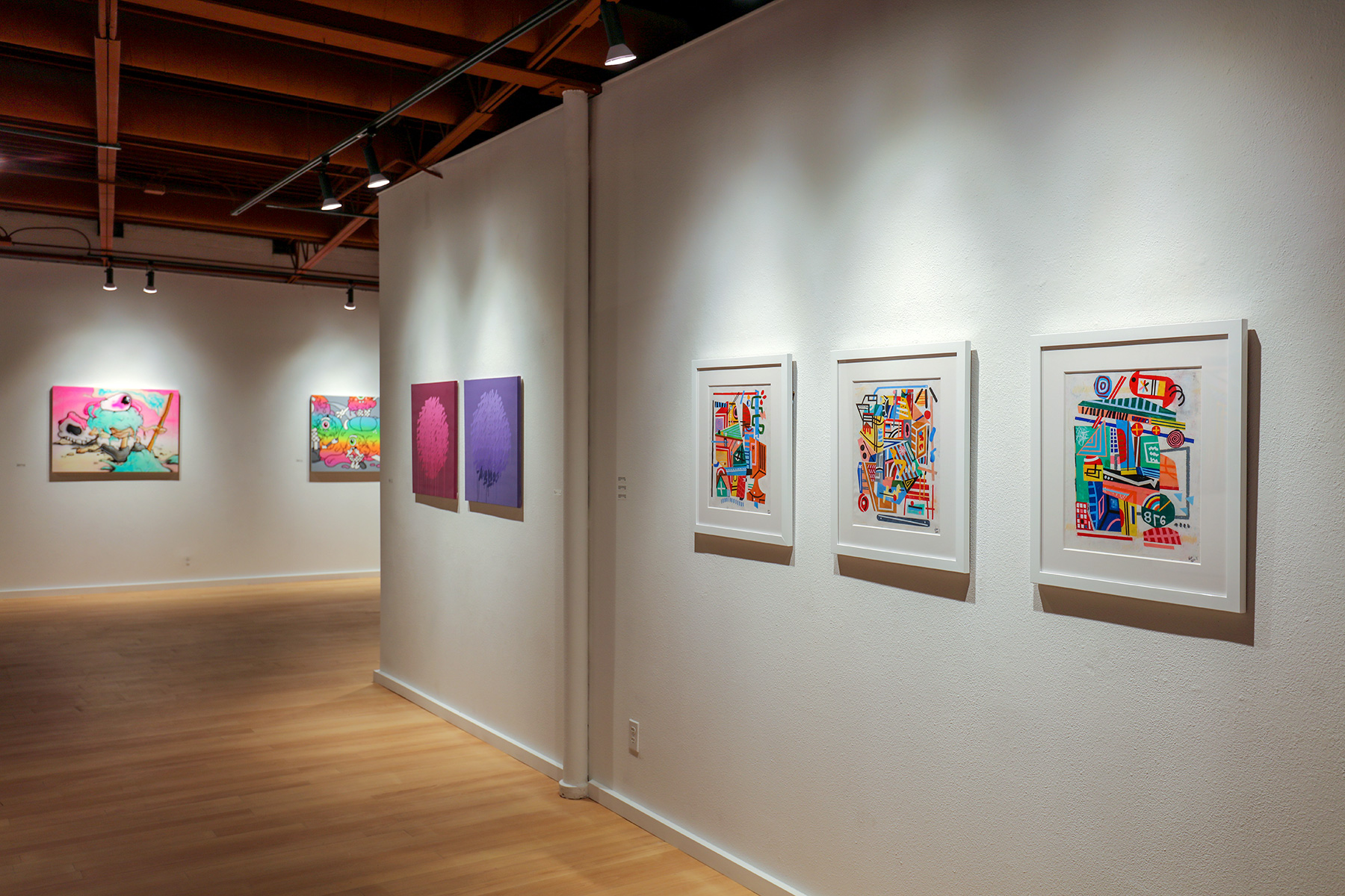
It’sALiving also paints text-based works, though he uses space differently; the circular shape that the repeated text creates are made of one word each—respectively, what they are titled: “Wishes” and “Awake.” These two pieces serve to remind us that what is contained or what emerges also has an external space which holds it—the acrylic dripping of parts of letters bleeds down the canvas—the wish and the awake becoming ongoing actions that only stop by way of imposed boundaries.
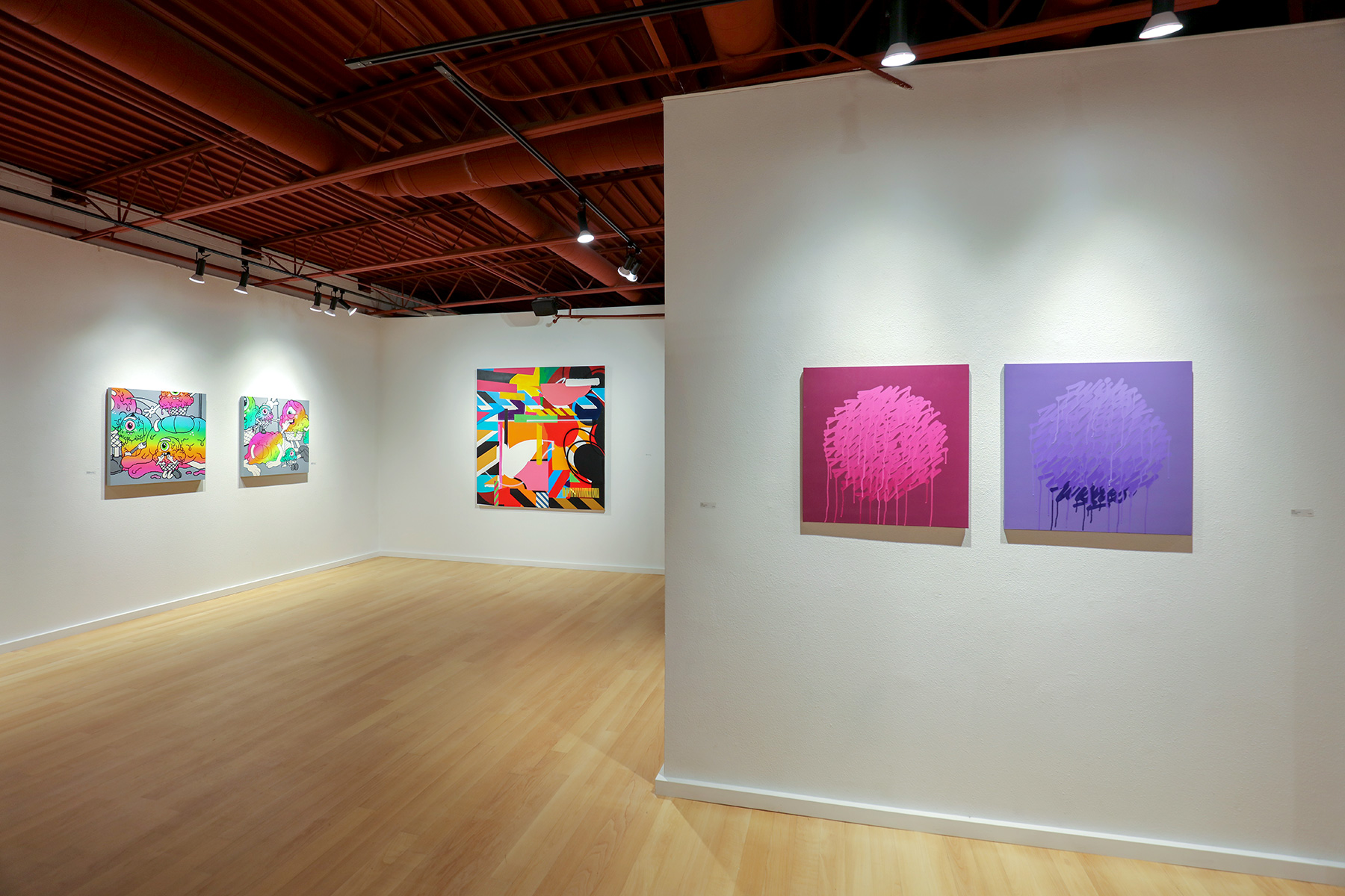
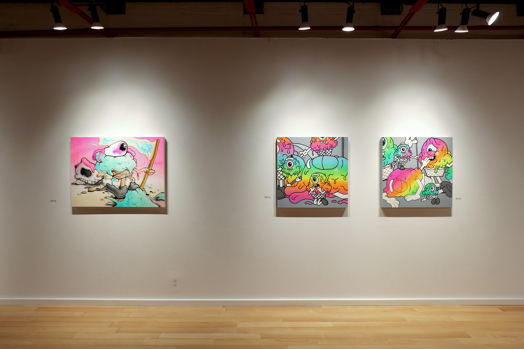
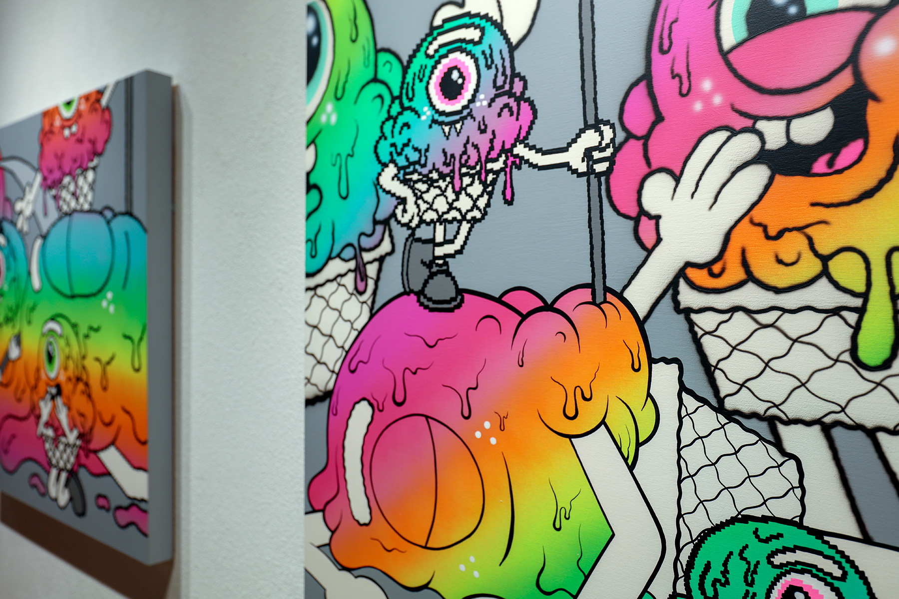
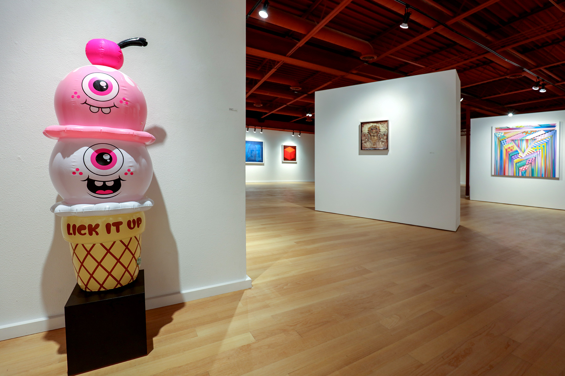
The supremely humorous characters and anthropomorphic ice cream cones of Buff Monster come in pastel and neon rainbows in “Melty Harmony” and “Melty Harmony 2.” “The Triumph of the Independent Spirit,” however, plays irreverently on the movie promo graphics for Leni Riefenstahl’s 1935 Nazi propaganda film, “The Triumph of the Will.” The upright, crisp clean conformist soldier from the film, in Buff Monster’s world, is now a lumpen melting milk product in a cone with legs, and shoes put on backwards.
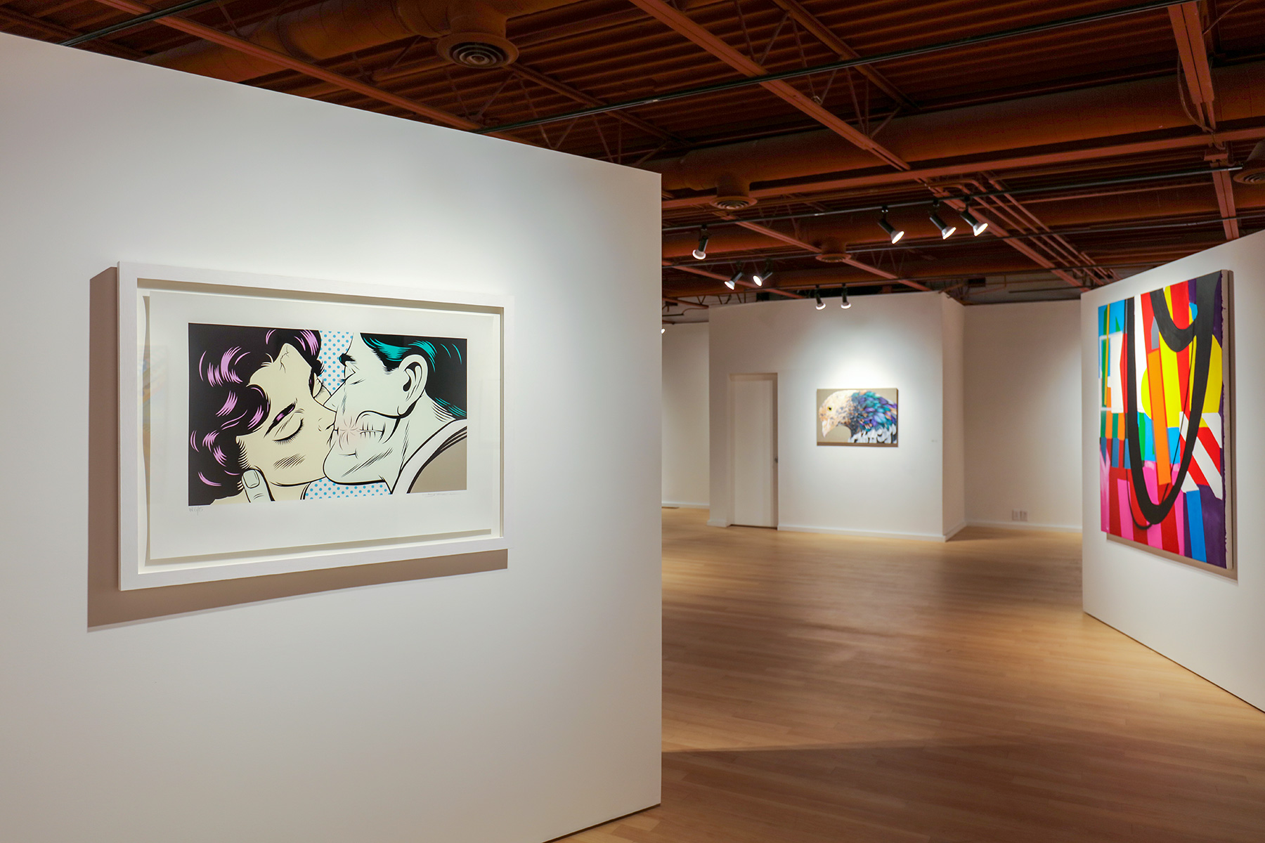
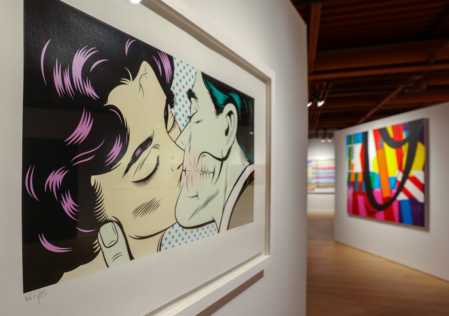
D*Face’s “Turncoat” and “Love Bites” take the cartoon genre and strip the strip art of its straight comic element to zero in on an underbelly or seriousness, without losing a bit of the style’s levity. The slight cracking and not-so-human horror on the lovers’ faces, in “Love Bites,” and the winged-horns in “Turncoat,” combined with the blueing, and Ben Day dots, all presume to turn ideal/idyllic into subversive kiss and tell.
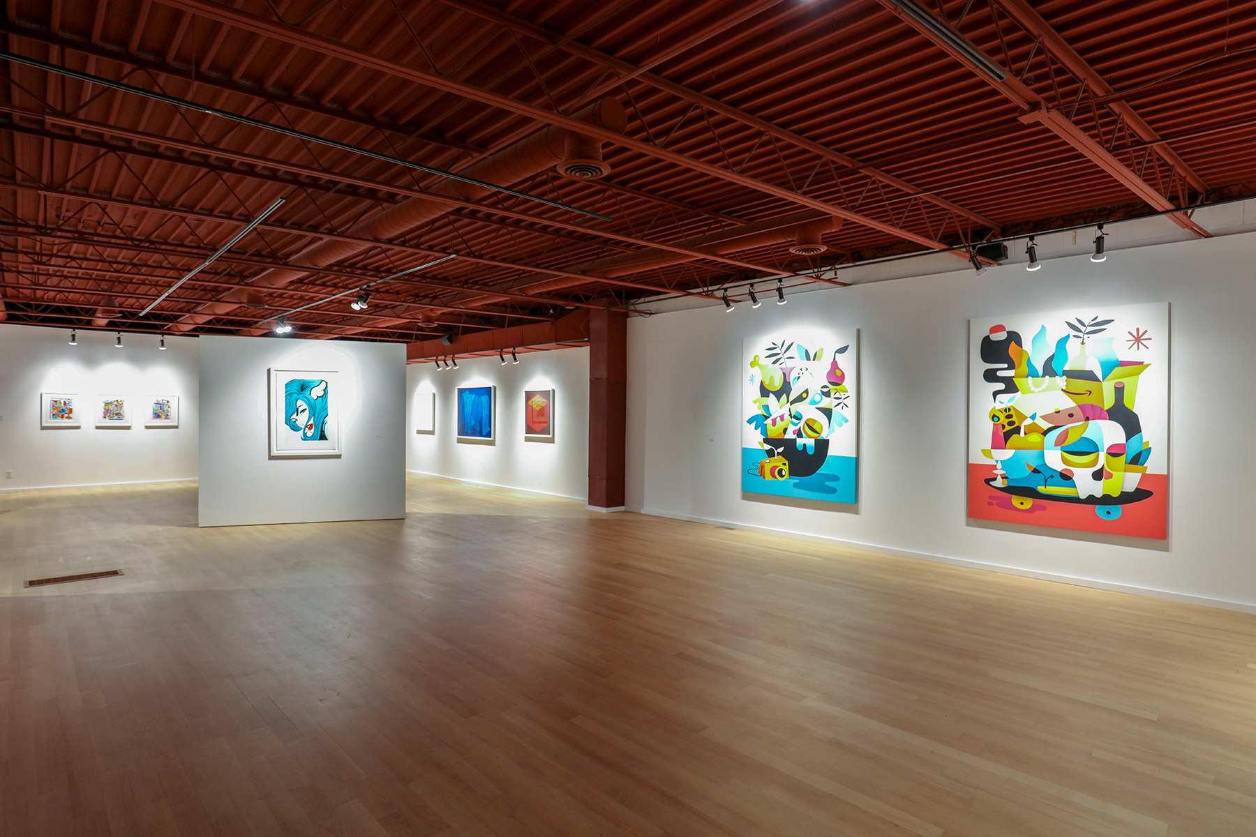
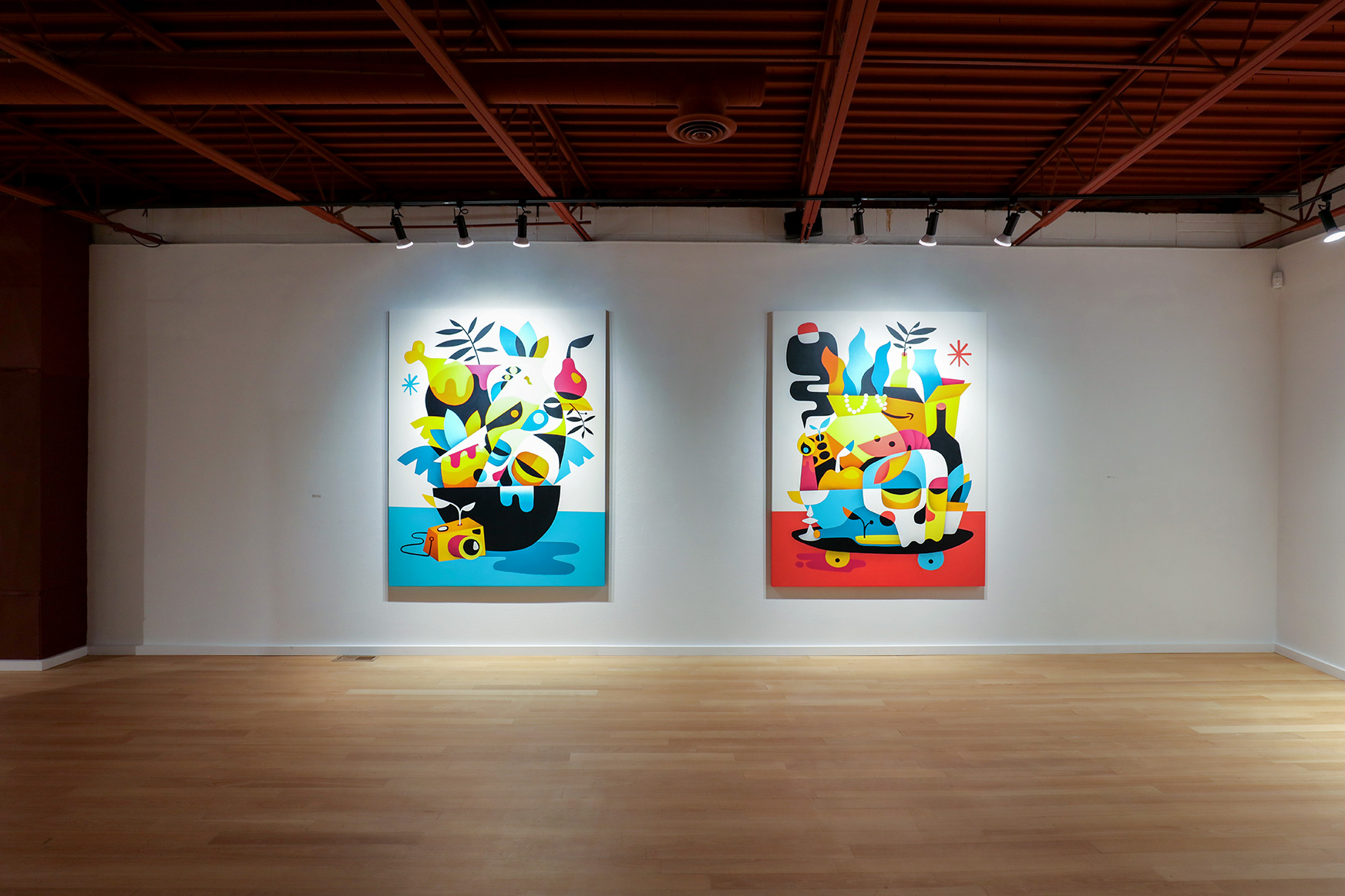
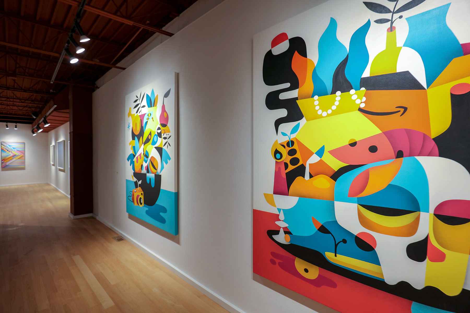
The works of Ruben Sanchez, “Vanitasserie” and “Vanitasserie II,” are brilliant mashups—abstract still lifes. These modern vanitases conjure Matisse-like collections of wonderful objects—the “staple” skull, fruit and chalice are there, but now Sanchez spins the Dutch genre into the 19th, 20th, and this century, adding a camera, a skateboard (even an Amazon prime box). The color palette is bright—yellows, oranges, blues. And the mortality that the vanitas usually depicts is now imbued with vitality (life) and dynamism (movement), and posterity (immortality).
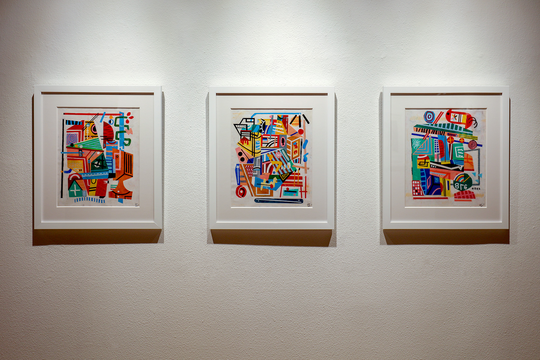
Adam Lucas (the artist behind Hanksy) shows three works in oil pastel, gouache and acrylic on paper. “Smaller Cities Found in the Middle” “Load up the Van, Heading to the Water,” and “Bookshelf, Bird and the NYC Bedroom” are works that are busy in the best sense—busy telling a pictorial story. His color and lines are almost diagrammatic, two-dimensional assemblages, with the frames as boxes. Replete with ships and birds, cameos and busts, Lucas is art-referential, and his Cubist influence comes through. But these paintings also conjure Stuart Davis eyes.
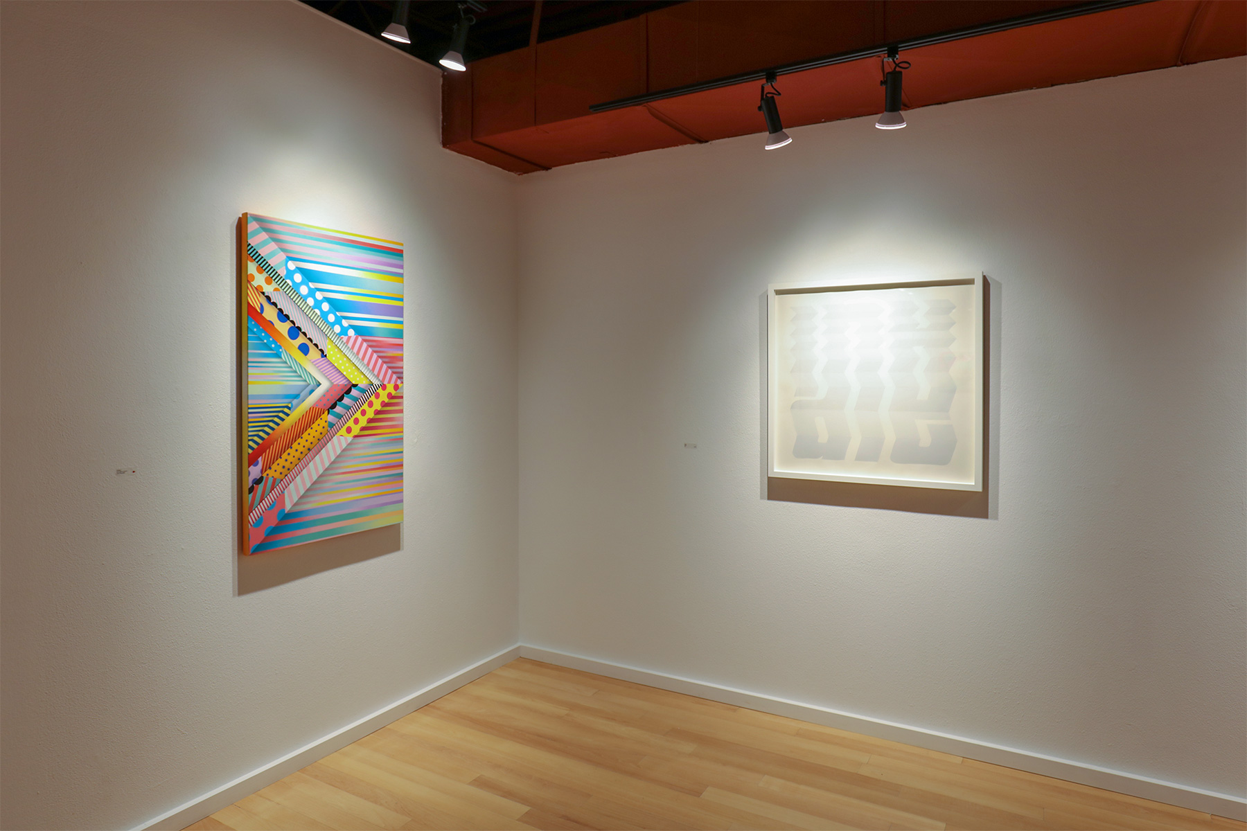
Jason Woodside’s “Downers,” “Sundown,” “Tri-Movement,” and “Down Texture” are created with spray paint on canvas—bringing the medium of the street inside and onto the gallery walls. High/low is too binary and outdated perhaps, but Woodside and his colleagues (or “heavy homies,” as he calls them) aim to use play and pun to lighten us, to shift power dynamics from up and down and inside to outside and back again, blurring the vibrantly-hued lines between everything we hold aesthetically dear. Woodside’s work seems to beg us to drop the preciousness and forge ahead in the hopeful and spectacular culture of all the surfaces we drive by, ride by, fly by—envisioning the possibility of joyful sight, asking us to dig in and help bring it on.
In Bloom runs through July 27th. Don’t miss the opportunity to be enlivened by this buoyant exhibit.
Exhibit Images